Microplastic exposure is not the same everywhere
A country level model of how waste systems, water infrastructure, and measurement constraints shape relative exposure
Microplastic exposure is not evenly distributed around the world. It changes meaningfully from country-to-country based on factors like waste management, water infrastructure, and the surrounding contamination burden.
In this paper, we built a country-level exposure model to estimate those differences using public infrastructure data and environmental observations. The goal was not to pretend we can measure personal exposure with perfect precision. It was to create a more grounded way to compare relative exposure across places, especially where direct measurements are sparse or inconsistent.
The exposure is global. The burden is not.
Since Thompson et al. first documented microscopic plastic fragments accumulating in marine sediments [26], the picture has widened considerably. Microplastic contamination is now understood as a diffuse environmental condition rather than a narrow marine problem. That expansion tracks with the scale of plastic production itself: humanity has manufactured more than 8.3 billion metric tonnes of virgin plastic since the 1950s, and roughly 60% of that material now resides in landfills or the natural environment [23]. Current estimates suggest that people ingest tens of thousands of microplastic particles each year through food, water, and air [24]. Analytical advances have also identified plastic particles in human blood [25], lung tissue [16], placental tissue [32], atherosclerotic plaque [31], and brain tissue [22]. The health consequences of that chronic, low dose exposure remain uncertain. The exposure itself does not.
What remains much less clear is how that burden differs from place-to-place. A person living in Jakarta is unlikely to encounter the same background microplastic environment as someone living in Tokyo. Waste management systems, water treatment quality, industrial activity, urbanization patterns, and dietary context all shape the contamination load surrounding everyday life. Quantifying those differences matters for two reasons. It helps build a more realistic picture of relative exposure, and it helps identify populations that may be living with a meaningfully higher baseline burden from a contaminant class whose biological significance is still being worked out.
Herein, we present a method for estimating country level microplastic exposure using national infrastructure indicators as the primary basis for comparison, with direct environmental observations used to calibrate the model. The aim is not to claim a perfect measure of personal exposure. It is to produce a more defensible relative framework across countries, including the many places where direct microplastic measurements remain sparse or absent.
Why place likely matters more than we think
At the environmental level, microplastic and nanoplastic particles have been identified across ocean water [5], freshwater systems [20], atmospheric air [6], drinking water [7], soil, food products, and human samples. Brahney et al. [33] showed that plastic deposition reaches even protected wilderness areas in the western United States, underscoring how far atmospheric transport can carry these particles beyond their obvious sources. Schwabl et al. [34] detected microplastics in human stool samples across eight countries, reinforcing that routine oral exposure is already part of ordinary life. The question is no longer whether people are exposed in the abstract. It is how much that exposure differs across real environments and through which pathways it accumulates.
That is where geography becomes useful rather than incidental. Waste management infrastructure is one of the clearest national level predictors of environmental microplastic burden. Countries that mismanage a large share of their plastic waste, through open dumping, weak collection systems, or uncontrolled landfills, release more plastic into surrounding waterways, soil, and air [1]. Water treatment quality adds another layer, especially through the drinking water pathway [2]. These differences are large, persistent, and well documented. They suggest that background contamination should not be assumed to be flat across countries, and that relative exposure is likely shaped in a meaningful part by infrastructure.
The biological backdrop makes those differences more worth quantifying, not less. Leslie et al. [25] detected microplastic particles in human blood, showing that ingested and inhaled particles can move beyond the gut and lungs into circulation. Marfella et al. [31] identified microplastics and nanoplastics in carotid artery plaque and reported an association with increased cardiovascular events. Ragusa et al. [32] found microplastics in placental tissue, raising clear questions about prenatal exposure. Prata [29] reviewed the respiratory implications of airborne microplastic exposure, and Wright and Kelly [30] synthesized broader toxicity pathways involving oxidative stress, inflammation, and endocrine disruption. None of these findings, individually or collectively, resolve the full question of causality. But they do make one point increasingly hard to ignore: microplastics are not obviously biologically inert, and exposure magnitude plausibly matters.
The hard part is comparison
If the goal were simply to show that microplastics exist in the environment, the field has already done that. The harder question is whether available measurements can be compared cleanly enough to say something credible about relative exposure across countries. That is where the problem begins.
Why the measurements do not line up cleanly
There is no shortage of individual measurements. There is a shortage of measurements that line up well enough to support straightforward cross country comparison. Studies differ in their lower detection limits, their analytical methods, and the units they report. A study measuring particles from 100 to 5000 μm is not functionally equivalent to one measuring from 1 to 5000 μm, even if both are labeled as microplastic concentration studies. Once particle size distribution, or PSD, power law extrapolation is used to normalize those datasets to a common reference window, those methodological differences can expand by orders of magnitude rather than disappear.
The coverage is also uneven. Observations are concentrated in Western Europe, East Asia, and North America, while large parts of Africa, Central Asia, and South America remain lightly sampled or unsampled. That makes the underlying evidence base geographically asymmetric before any modeling even begins. Freshwater observations illustrate the problem clearly: the dataset is heavily dominated by USGS material, with 93% of freshwater data coming from the United States [20]. In other words, what looks like a global empirical record is, in some media, still a very partial one.
Some artifacts are even more specific. Drinking water studies, for example, often use incompatible measurement windows across countries. That means a naive comparison can confuse methodological reach with true environmental burden. A country measured with a 1 μm lower detection limit can appear dramatically more contaminated than a country measured at 100 μm, even when the underlying environmental reality may be similar. Simply averaging all available measurements would not solve that problem. It would formalize it.
A more stable way to compare countries
That is why this model does not begin by asking which countries have the highest raw measured concentrations. It begins by asking which inputs are standardized enough to support meaningful comparison. The approach taken here is covariate driven: authoritative national indicators do the primary ranking work, while direct environmental observations are used to calibrate the model rather than override it.
The structure is intentionally simple. A Contamination Index draws from mismanaged plastic waste data reported by Jambeck et al. [1] and safely managed drinking water coverage from the WHO and UNICEF Joint Monitoring Programme [2]. That index is then linked to environmental concentration through per-medium log linear regression using countries that do have direct observations. From there, route specific dose modeling uses the ICRP 66 framework [3] for inhalation, along with gastrointestinal bioavailability for ingestion, and then extends through PSD extrapolation and bioavailability modeling to estimate total body burden. Those results are finally translated into the 0 to 12 weight scale used by the Winnow exposure calculator.
The value of this approach is not that it eliminates uncertainty. It does not. The value is that it places the uncertainty in a more defensible location. Instead of letting cross country rankings be driven by whichever studies had the lowest detection threshold or the noisiest sampling frame, it anchors the model in national level indicators that are at least more standardized and more widely available. That makes it possible to generate relative exposure weights for countries with no direct microplastic measurements at all, while also reducing the risk that methodological artifacts will be mistaken for geographic truth. In this model, observations still matter. They help calibrate the relationship between infrastructure and contamination. They just do not get to dominate the ranking when the measurement architecture itself is unstable.
How the model works
From what the model is built
The model draws from two different kinds of inputs: national infrastructure data and direct environmental observations. That distinction matters. The infrastructure data provides the broad comparative backbone of the model, while the observation data helps anchor that backbone to measured contamination in the real world. The two are related, but they are not asked to do the same job.
National signals: waste and water
At the country level, waste and water management indicators were compiled from three main sources: Jambeck et al. [1], the WHO/UNICEF Joint Monitoring Programme, or JMP, [2], and the World Bank’s What a Waste 2.0 database [8]. Together, these sources provide the core inputs needed to estimate how strongly national infrastructure may shape background microplastic contamination. Jambeck et al. [1] contributes mismanaged plastic waste percentages for 98 countries. JMP [2] contributes safely managed drinking water coverage for 167 countries. What a Waste 2.0 [8] adds supporting waste system context, including waste collection, open dumping, and recycling indicators across 180 countries.
| Source | Indicator | Countries |
| Jambeck et al. [1] | Mismanaged plastic waste (%) | 98 |
| WHO/UNICEF JMP [2] | Safely managed drinking water (%) | 167 |
| What a Waste 2.0 [8] | Waste collection rate (%), open dump (%), recycling (%) | 180 |
Coverage is incomplete, but still broad enough to support useful comparison. Of the countries with any relevant covariate data, 77 have both Jambeck waste data and JMP water data, which allows direct Contamination Index calculation. For countries with missing fields, the model uses structured imputation rather than exclusion. Missing water treatment values default to the global average of 71.5%, and missing waste inputs are estimated from waste collection rates where those data are available. That approach does not remove uncertainty, but it preserves coverage while keeping the imputation rules visible.
Direct measurements from air, freshwater, and ocean
Direct environmental observations were compiled across three media: air, freshwater, and ocean. In total, the model draws from eight major datasets, including Evangeliou et al. [6] for atmospheric observations, USGS freshwater surveys [20], NOAA NCEI [21], Isobe et al. [9], Eriksen et al. [5], and additional literature compilations across all three media. Together, these sources create a larger empirical base than any single dataset could provide on its own.
| Dataset | Medium | Observations | Coverage |
| Evangeliou et al. [6] | Air | ~200 | 76 studies, global |
| Literature compilation | Air | ~50 | Various |
| USGS Freshwater [20] | Freshwater | ~660 | US streams/lakes |
| Literature compilation | Freshwater | ~30 | Global |
| NOAA NCEI [21] | Ocean | ~500 | Global |
| Isobe et al. [9] | Ocean | ~400 | Global upper ocean |
| Eriksen et al. [5] | Ocean | ~250 | Global surface |
| Literature compilation | Ocean | ~40 | Various |
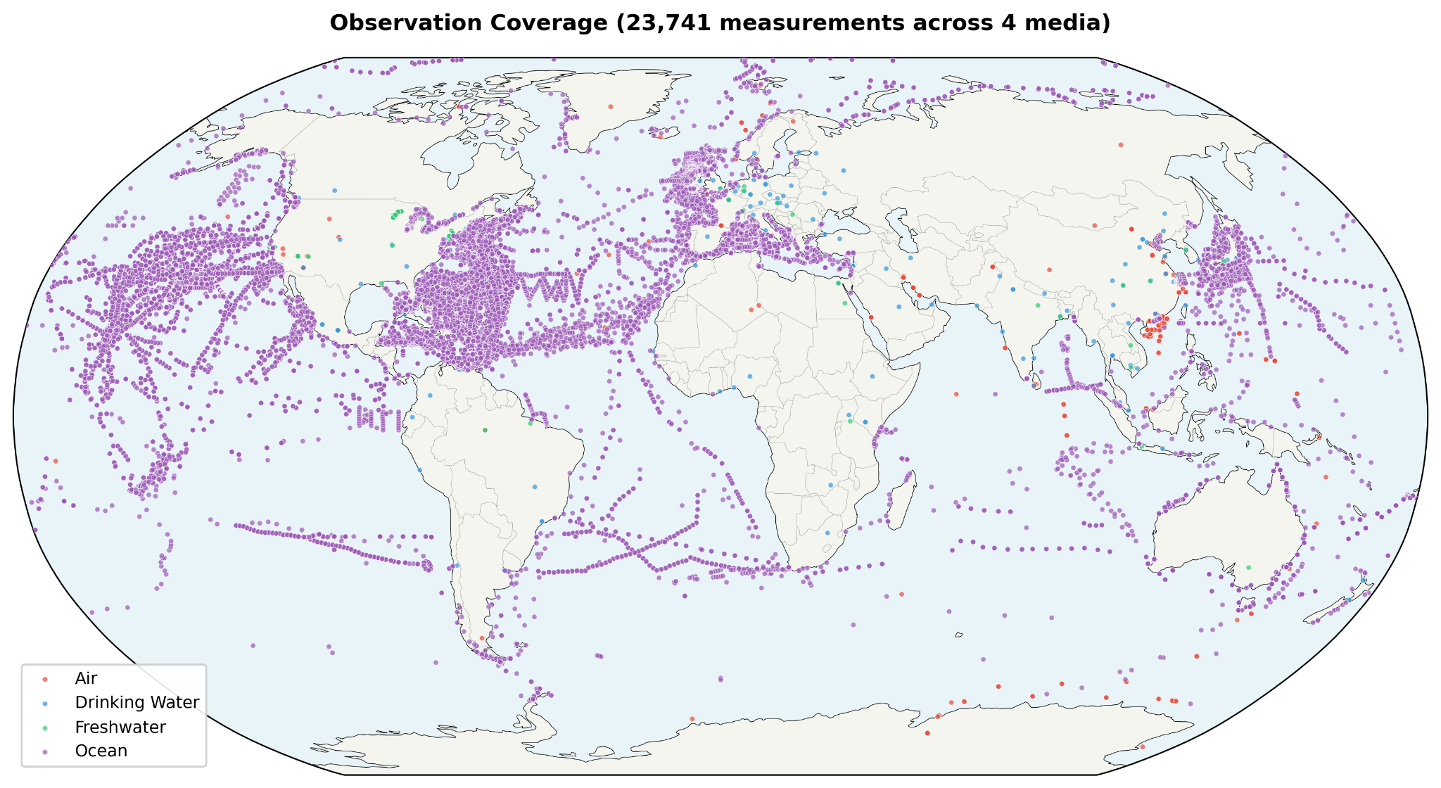
After quality control, including coordinate validation, outlier removal, and deduplication, 2,129 observations remain across 64 countries. Those observations break down into 247 air measurements across 24 countries, 693 freshwater measurements across 19 countries, and 1,189 ocean measurements across 50 countries. Twenty three countries have observations in more than one medium. That multi medium overlap matters because it allows the model to calibrate environmental burden with somewhat more structure than a purely single medium dataset would allow. At the same time, the observation base remains uneven. Some media are much better sampled than others, and some regions are represented far more heavily than the global map might suggest at first glance.
Why drinking water was left out of the core model
One of the more important methodological choices in the model is what it leaves out. Drinking water observations were excluded entirely, not because the pathway is unimportant, but because the existing cross country measurement record is too inconsistent to use cleanly. US drinking water studies [10], for example, often use a 100 to 5000 μm detection window, while Chinese [11] and German [12] studies use a 1 to 5000 μm window. Once PSD power law extrapolation is used to normalize those measurements into a common reference range, the difference becomes extreme: the narrower US window produces roughly 1,900x amplification, while the wider Chinese window produces closer to 40x. At that point, the comparison is no longer mainly about geography. It is about method.
That distortion is large enough that including drinking water directly would risk overwhelming the signal the model is actually trying to estimate. It would also create obviously implausible outcomes, such as US drinking water dominating global rankings despite the United States having comparatively strong water treatment infrastructure. For that reason, drinking water is handled indirectly instead. Its influence is partially captured through the freshwater medium and through the calculator’s separate water source questions, such as bottled water frequency and tap water filtering. In other words, the pathway is not ignored. It is simply not allowed to distort the comparative model at the country level.
Building a contamination signal
To compare countries in a way that is both simple and grounded, the model builds a Contamination Index, or CI, from two broad conditions: how much plastic waste is likely to escape into the environment, and how much drinking water infrastructure is likely to reduce downstream exposure. Rather than treating waste mismanagement alone as the whole story, the index combines infrastructure quality with absolute waste intensity. That distinction matters. A country that mismanages a large fraction of a very small waste stream is not in the same position as a country that mismanages a similar fraction of a much larger one.
The CI is defined as:
CI = sqrt(mismanaged_waste_pct/100 × per_capita_intensity) × (1 - safely_managed_water_pct/100)
where per_capita_intensity is per capita mismanaged plastic waste, expressed in kilograms per person per day and normalized to the global median of 0.012 kg per person per day, with the resulting value capped at 10 times the median. In effect, the formula asks two related questions at once: what share of plastic waste is being mismanaged, and how much mismanaged plastic is actually entering the environment on a per person basis. The geometric mean, implemented here as the square root of the product, prevents either of those dimensions from overwhelming the other.
This is an important departure from percentage-only approaches. Percentage alone can flatten meaningful differences in absolute burden. A country mismanaging 80% of a small waste stream does not create the same likely contamination conditions as one mismanaging 80% of a much larger stream. The CI is designed to preserve that distinction. Bangladesh, for example, still ranks high because of very poor waste handling combined with moderate per capita intensity, even though its total per capita waste generation remains relatively low. Indonesia, by contrast, combines high waste mismanagement with substantially greater per capita mismanaged plastic, producing a much stronger contamination signal.
Per capita mismanaged plastic waste is calculated using total national mismanaged plastic waste from Jambeck et al. [1], divided by total population from What a Waste 2.0 [8], rather than coastal population. That choice is deliberate. The original Jambeck per capita metric used coastal population as the denominator, which can materially inflate values for island nations and coastal geographies. For the purposes of a broader country level exposure model, total population is the more stable denominator. It better reflects how national waste burden may diffuse across the environments in which people actually live.
The water term plays a different role. Safely managed drinking water coverage from JMP [2] is used as a moderating factor, scaling contamination downward where infrastructure is stronger and leaving it elevated where treatment gaps are wider. This does not imply that drinking water is the only route by which water infrastructure matters. It is better understood as a national signal for the broader quality of systems that separate waste from everyday human exposure. Countries with stronger water treatment capacity are, in general, better positioned to limit at least some downstream contamination burdens.
| CI Range | Interpretation | Example Countries |
| 0.000 | Pristine: 0% mismanaged, excellent treatment | Singapore, Japan, Germany |
| 0.001-0.10 | Low: developed nations, good infrastructure | US, UK, Australia, Brazil |
| 0.10-0.50 | Moderate: significant waste or treatment gaps | India, China, Turkey, Mexico |
| 0.50-1.00 | High: poor waste management + low treatment | Nigeria, Philippines, Vietnam |
| 1.00-2.50 | Very high: severe waste + treatment deficits | Indonesia, DRC, Sri Lanka |
The CI also does more than estimate environmental concentration. In the broader model, it serves as an ambient exposure multiplier on body burden. That is an attempt to account for the fact that not all relevant pathways are directly modeled in the three measured media. Local food contamination, street dust, open dump exposure, industrial runoff into agricultural land, and other background sources all contribute to real world burden in ways that are difficult to parameterize directly. CI acts as a proxy for that wider ambient environment. It is not a perfect measure of those pathways, but it is a transparent way of recognizing that air, freshwater, and ocean observations alone do not capture the whole exposure picture.
One way to read the final scale is by tier rather than exact number. Countries with a CI near zero represent relatively strong infrastructure conditions, including very low waste mismanagement and high quality water treatment. At the other end, countries with CI values above 1.0 combine severe waste leakage with major treatment deficits, making them more likely to sustain a meaningfully higher background contamination burden. The index is not meant to describe every nuance of a country’s environmental reality. It is meant to summarize a complex system into a comparative signal that is simple enough to model and transparent enough to interrogate.
Linking infrastructure to concentration
Once the Contamination Index is defined, the next question is how to translate that infrastructure signal into estimated environmental concentration. The model does that through a calibration step rather than a direct observational average. In other words, it asks how measured contamination tends to scale with CI in countries that have enough data, and then uses that relationship to estimate concentrations more consistently across the full country set.
For each environmental medium, the model fits a log linear regression of the form:
log(median_concentration) = a + b x log(1 + CI)
The use of the logarithmic form is practical. Environmental contamination data is typically skewed, and the country level differences the model is trying to capture are often multiplicative rather than additive. Working in log space produces a more stable relationship between CI and concentration, while also matching the reality that microplastic burden tends to vary by orders of magnitude rather than by small linear increments.
Calibration is performed using country-level observation medians drawn from the 64 countries that have direct data. For air and ocean, there are enough countries with sufficient observations to fit the regression directly. Freshwater is different. Only two countries have at least three freshwater observations suitable for calibration, and both are heavily influenced by US-biased data, so freshwater does not support a stable regression in the same way. In that case, the model falls back to an empirical formula anchored to CI rather than pretending the calibration is stronger than it is. That is not an elegant workaround so much as an honest reflection of the available data.
This section also contains one of the model’s most important design decisions: direct observations are used to calibrate the regression, but they are not directly blended back into each country’s final estimate. That choice is deliberate. If raw or normalized observations were mixed directly into country level predictions, many of the same PSD normalization artifacts described earlier would simply re-enter the model through the side door. Countries measured with different size windows or methods would regain undue influence over the rankings. By predicting all country concentrations from CI through the calibrated relationship, the model keeps the observation data in its proper role: informative, but not sovereign.
The result is a more stable framework for comparison. A country with no direct microplastic observations can still receive a defensible estimated concentration if it has national covariate data. A country with many observations but major methodological inconsistencies does not automatically dominate the rankings. And the final country weights reflect the modeled relationship between standardized infrastructure indicators and environmental contamination, rather than whichever dataset happened to be most abundant or most sensitive.
That does not mean calibration is free from error. The regression itself still inherits some of the underlying measurement noise, because the country medians used to fit it come from studies with different methodologies. As the paper later notes, the coefficients absorb part of that artifact, which means the CI to concentration relationship is itself only as clean as the available evidence allows. But this is still a more defensible compromise than treating heterogeneous observations as if they formed a directly comparable global record.
Extending the model into the nano range
One of the biggest challenges in microplastic exposure modeling is that the measured portion of the particle spectrum is not the whole spectrum that may matter biologically. Most environmental studies observe only part of the size range directly, while the smallest particles, especially in the nanoplastic range, remain much harder to capture consistently. To bridge that gap, the model uses particle size distribution, or PSD, extrapolation to extend predicted concentrations beyond the measured microplastic window into a fuller size spectrum.
Why smaller particles multiply fast
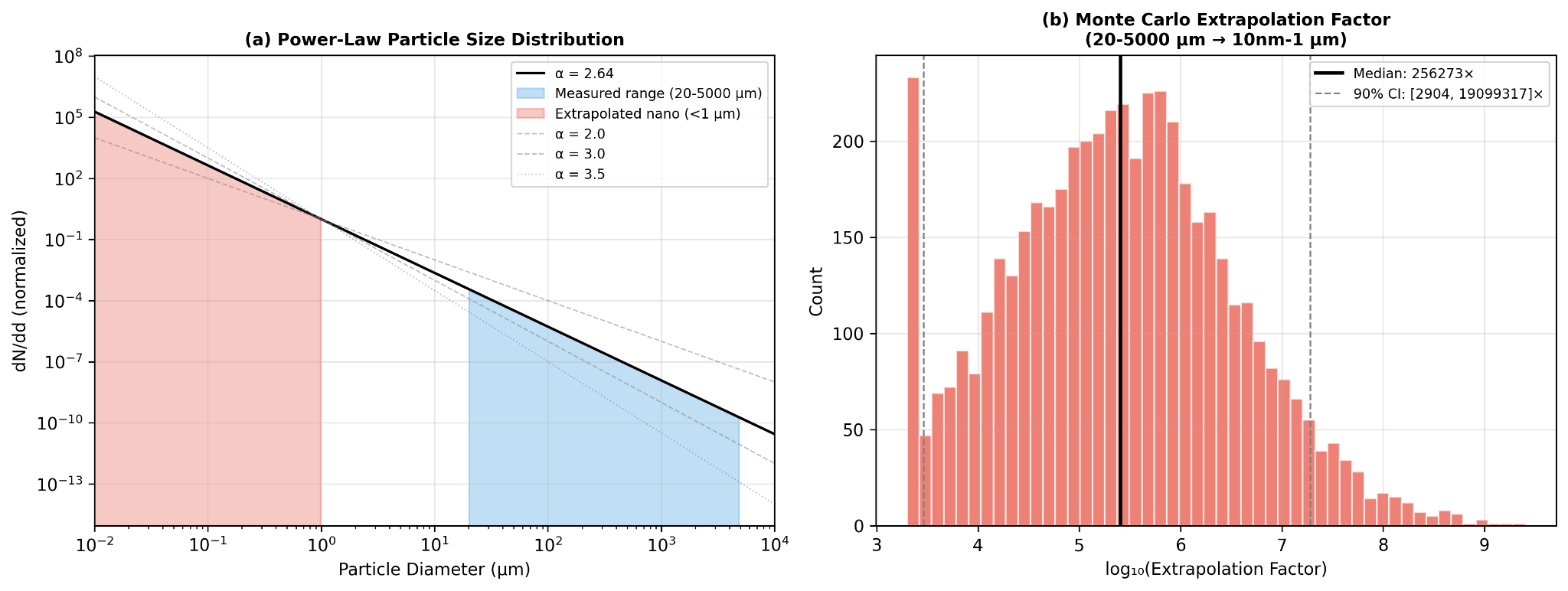
The core assumption is that environmental fragmentation follows a power law distribution [13-14]. In practical terms, that means larger plastic fragments break down into progressively more numerous smaller particles rather than remaining evenly distributed across size classes. The relationship is expressed as:
dN/dd proportional to d(-alpha)
where d is particle diameter and alpha is the power law exponent. In this model, Mohamed Nor et al. [4] provides the working estimate of alpha at 2.64, which is treated as consistent with an environmental fragmentation cascade rather than an arbitrary fitting choice.
From what is measured to what is inferred
Starting from a predicted concentration in the reference size range of 1 to 5000 μm, the model distributes particles across six size bins spanning 10 nm to 5 mm using that power law relationship. The practical consequence is significant: for typical parameter values, the extrapolation implies roughly 103 times more nanoplastic particles than directly measured microplastic particles, or about 1,000 nanoplastic particles for every one measured microplastic particle. This does not mean the model pretends those nanoplastics were directly observed. It means the model treats them as the mathematically implied continuation of the same fragmentation pattern.
That step matters because the smallest particles may contribute disproportionately to absorbed dose later in the pipeline, even when they represent only an inferred share of the total size distribution. In other words, PSD extrapolation is not just a technical flourish. It is one of the bridges between what environmental studies can reliably count and what biological exposure models still need to account for.
Where the uncertainty really sits
This is also one of the least certain parts of the model. The extrapolation factor is highly sensitive to the value of alpha, which means even modest changes in the assumed fragmentation slope can produce very large differences in estimated nanoplastic abundance. To reflect that, the model uses Monte Carlo simulation with alpha drawn from a truncated normal distribution centered at 2.64, with sigma 0.35 and bounds from 2.0 to 4.0. Under that approach, the 90% confidence interval spans roughly 3 to 4 orders of magnitude. That is not a small caveat. It is a direct acknowledgment that nanoplastic abundance remains one of the major unresolved uncertainties in the field.
The value of keeping this section is not that it resolves the uncertainty. It is that it makes the assumption visible. Rather than hiding the nano range behind a false sense of precision, the model states plainly that this part of the pipeline is inference driven, parameter sensitive, and scientifically unsettled. That fits the broader logic of the paper: be explicit about where the model is strong, and equally explicit about where it is still leaning on structured approximation.
From environmental burden to body burden
Once concentrations are distributed across particle sizes, the model still has to answer a more practical question: how much of that environmental burden is likely to matter to the body at all. That is the role of the dose estimation step. Rather than treating every encountered particle as equally relevant, the model routes particles through the main exposure pathways, accounts for where they deposit, and then applies size dependent assumptions about how much is actually absorbed or retained. Human microplastic exposure is framed here through three routes: inhalation, ingestion, and dermal absorption. The model includes the first two and excludes the third, because current evidence does not support meaningful penetration of intact skin by most particles [4,15].
How particles move through the body
Inhalation is modeled through the air pathway using the ICRP 1994 Human Respiratory Tract Model, Publication 66 [3], simplified for nose breathing at light activity. The core idea is that inhaled particles do not all behave the same way once they enter the respiratory tract. Their fate depends strongly on size. Some deposit in the nose and throat, some in the tracheobronchial region, and some reach the alveoli deep in the lungs. The model uses that size-dependent deposition pattern to distinguish between particles that are effectively swallowed and particles that are retained more directly in lung tissue.
| Size Bin | Total Deposition | Alveolar | Tracheobronchial | Extrathoracic |
| <100 nm | 80% | 35% | 8% | 37% |
| 100 nm - 1 μm | 15% | 8% | 3% | 4% |
| 1-10 μm | 60% | 15% | 8% | 37% |
| 10-100 μm | 95% | 1% | 3% | 91% |
| >100 μm | 100% | 0% | 0% | 100% |
That distinction matters because inhalation is not treated here as a wholly separate exposure universe. Most inhaled microplastics that deposit in the extrathoracic and tracheobronchial regions are cleared to the gastrointestinal tract through mucociliary transport, typically within hours, and then follow the ingestion pathway. In that sense, inhaled microplastics can be thought of as largely a subset of ingested microplastics. The unique inhalation contribution is alveolar retention. In the model, about 20% of particles deposited in the deep lung are treated as permanently retained in tissue, a choice supported in part by Jenner et al. [16], who identified microplastics in 11 of 13 human lung samples. The remaining alveolar fraction is split between slow clearance to the GI tract and lymphatic transport.
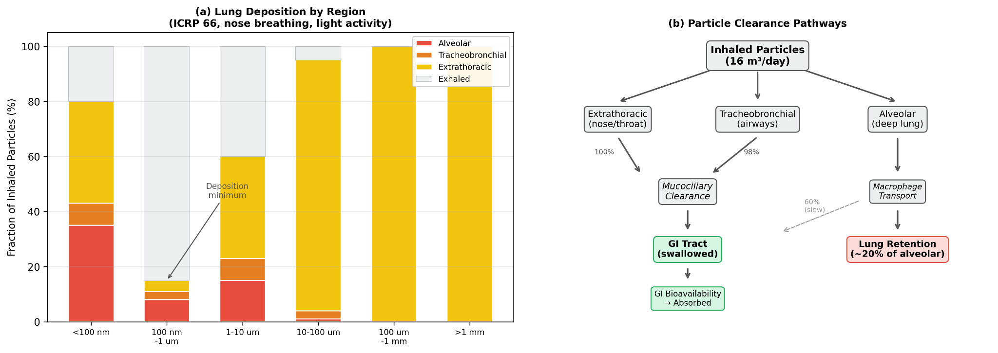
The clearance assumptions are explicit. Extrathoracic deposition is treated as 100% swallowed to the GI tract. Tracheobronchial deposition is treated as 98% cleared to the GI tract via the mucociliary escalator, with a half life of roughly 2 to 24 hours. Alveolar deposition is treated as 60% cleared to the GI tract through macrophage mediated transport, 20% permanently retained in lung tissue, and 20% diverted to lymph nodes. These are simplifying assumptions, but they allow the model to separate temporary passage from longer term tissue burden rather than collapsing inhalation into a single number.
Ingestion is modeled through freshwater and ocean linked pathways, along with the share of inhaled particles that are eventually cleared into the GI tract. Once particles reach the gastrointestinal system, the relevant question becomes bioavailability: what fraction crosses the gut barrier rather than simply passing through. Here again, size does much of the work. The model does not assume that all ingested particles are absorbed. It assumes that most are not, and that the smallest particles are disproportionately important.
Dermal absorption is excluded. The reason is not that dermal exposure is impossible in theory, but that the intact stratum corneum is treated as an effective barrier for particles larger than 100 nm. Nanoplastics below that threshold may have limited follicular penetration, with theoretical rates around 0.05% via hair follicles [15], but the contribution is judged negligible relative to inhalation and ingestion. In the model, dermal uptake is therefore omitted rather than padded in as a speculative extra term.
The resulting body burden equation is straightforward:
Body burden = sum over media of: GI_absorbed(medium) + lung_retained(air)
GI absorbed includes both directly ingested particles and particles that first entered through inhalation and were then cleared into the gut. Lung retained refers to the deep lung fraction treated as remaining in alveolar tissue. This keeps the accounting simple while still respecting that different pathways do not contribute in the same way.
How exposure is estimated across routes
To translate concentration into exposure, the model applies medium specific intake rates. Air is modeled at 16.0 m3 per day using the EPA Exposure Factors Handbook [28]. Freshwater is modeled at 0.01 liter equivalent per day through the freshwater food chain, and ocean exposure at 0.05 liter equivalent per day through seafood consumption. These latter values are estimates rather than direct physiological constants, which means they should be read as modeling assumptions intended to approximate route contribution rather than as literal daily consumption of environmental water.
| Medium | Rate | Unit | Source |
| Air | 16.0 | m3/day | EPA Exposure Factors Handbook [28] |
| Freshwater | 0.01 | L-equiv/day | Estimated via freshwater food chain |
| Ocean | 0.05 | L-equiv/day | Estimated via seafood consumption |
Why particle size matters biologically
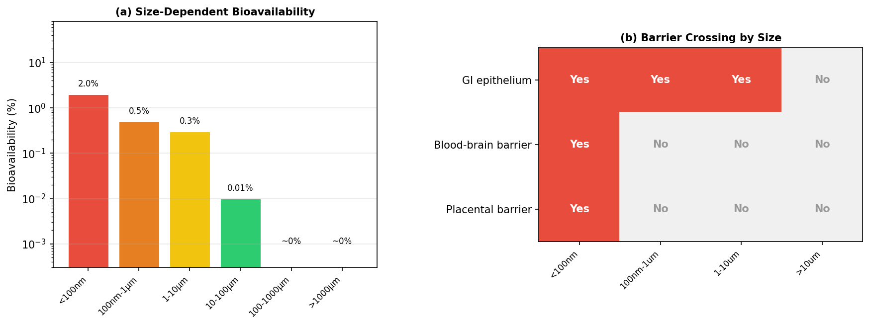
Once particles reach the GI tract, the model applies size specific bioavailability values. Particles smaller than 100 nm are assigned 2% bioavailability based on Walczak et al. [17]. Particles from 100 nm to 1 μm are assigned 0.5% based on Walczak et al. [18]. Particles from 1 to 10 μm are assigned 0.3% using Mohamed Nor et al. [4]. Particles from 10 to 100 μm drop to 0.01% based on Volkheimer [27]. Particles from 100 to 1000 μm are treated as approximately zero based on EFSA [19], and particles larger than 1000 μm are treated as too large for meaningful uptake.
| Size Range | Bioavailability | Primary Source |
| <100 nm | 2% | Walczak et al. [17] |
| 100 nm - 1 μm | 0.5% | Walczak et al. [18] |
| 1-10 μm | 0.3% | Mohamed Nor et al. [4] |
| 10-100 μm | 0.01% | Volkheimer [27] |
| 100-1000 μm | ~0% | EFSA [19] |
| >1000 μm | ~0% | Too large for uptake |
This is one of the model’s most consequential assumptions. Nanoplastics make up only an inferred fraction of total particle burden, but they dominate absorbed dose because their estimated bioavailability is far higher than that of larger microplastics. A particle smaller than 100 nm is modeled as roughly 200 times more bioavailable than a particle above 10 μm. That means the biological relevance of the size distribution is not just about particle count. It is about which particles have any realistic chance of crossing into tissue at all.
That logic also helps explain why the model keeps the nano range visible despite the uncertainty discussed earlier. If the smallest particles are the most absorbable, then ignoring them would distort the biological picture just as surely as overstating them would. The model instead tries to hold both truths at once: nanoplastic abundance is still uncertain, but the smallest particles likely matter disproportionately if the goal is absorbed burden rather than mere passage. Fournier et al. [35] further supports that emphasis by showing that particles smaller than 100 nm can cross major biological barriers, including the blood brain barrier and placenta, in radiolabeled nanopolystyrene translocation studies during late stage pregnancy.
Turning dose into a usable score
Once total absorbed dose is estimated, the model still has to convert that output into something the calculator can actually use. That is the purpose of the weight mapping step. Rather than carrying forward raw particles per day, which are difficult to interpret and awkward to integrate into a broader lifestyle score, the model converts dose into a standardized exposure score and then into a country weight on the calculator’s 0 to 12 scale.
The process happens in two stages. First, total absorbed dose is normalized across all countries to a 0 to 100 exposure score using log percentile scaling. That step matters because the modeled dose distribution is highly skewed. Some countries are estimated to have much higher background burden than others, and a simple linear mapping would compress too much of the lower range while letting the highest values dominate the scale. Log percentile scaling creates a more usable spread while preserving the fact that the underlying differences are still large.
Second, that 0 to 100 score is mapped to a 0 to 12 calculator weight through piecewise linear interpolation. In practice, this means the scale is divided into score bands, each corresponding to a weight range anchored by representative countries. Countries at the lowest end of modeled exposure, such as Singapore, Iceland, and Switzerland, fall into the 0 to 10 score band and receive weights from 1.0 to 2.5. Countries such as the United States, Japan, and the United Kingdom fall into the next band, with weights from 2.5 to 5.0. Midrange countries including Brazil, Turkey, and Mexico occupy the 5.0 to 7.5 range. Higher burden countries such as the Philippines, Vietnam, and Bangladesh fall into the 7.5 to 10.0 range, while the highest burden group, including Indonesia, Nigeria, Cambodia, and the Democratic Republic of the Congo, maps to weights from 10.0 to 12.0.
The purpose of this step is not to imply that the difference between, say, a weight of 6.0 and 7.0 is a precise biological threshold. It is to translate a modeled exposure gradient into a practical scoring input that can live alongside the calculator’s other factors. The result is a country level signal that is interpretable, bounded, and proportionate to the broader architecture of the tool.
Within the calculator itself, geographic weight is only one component of the overall score. The model uses an additive framework: baseline 35 plus the sum of factor weights, clamped to a final score of 1 to 100. Country weight is combined with an urban or rural modifier of +4, +2, or 0, meaning geography can contribute up to roughly 16 points of the total score. That is enough to matter meaningfully without overwhelming the rest of the user’s lifestyle and exposure profile.
What the model finds
The results are best read in two layers. First, they show how much usable country and observation coverage the model was able to assemble. Second, they show what that assembled framework actually produces: a ranked set of country level exposure weights, along with a clear sense of where the evidence is stronger and where it remains more inference driven.
How much of the world the model reaches
At the infrastructure level, the compiled covariate dataset reaches 202 countries (territories inclusive) in total. Within that set, 98 countries have Jambeck mismanaged waste data [1], 149 have WHO/UNICEF JMP safely managed water data [2], and 77 have both waste and water inputs available for direct Contamination Index calculation. After filtering aggregate and regional entries and applying the model’s imputation rules for missing fields, 170 countries receive exposure weight estimates. That does not eliminate uncertainty, but it does mean the model achieves broad geographic reach even where direct microplastic observations remain sparse.
Where the measurement record is strong, and where it is thin
The harmonized observation dataset contains 2,129 quality controlled measurements across 64 countries and three environmental media. Air contributes 247 observations across 24 countries, drawing primarily from Evangeliou et al. [6] and related literature compilations. Freshwater contributes 693 observations across 19 countries, dominated by USGS freshwater surveys [20]. Ocean contributes 1,189 observations across 50 countries, drawing from NOAA NCEI [21], Isobe et al. [9], Eriksen et al. [5], and additional literature sources. Twenty three countries have observations in more than one medium.
| Medium | Observations | Countries | Key Datasets |
| Air | 247 | 24 | Evangeliou et al. [6], literature compilation |
| Freshwater | 693 | 19 | USGS freshwater surveys [20], literature compilation |
| Ocean | 1,189 | 50 | NOAA NCEI [21], Isobe et al. [9], Eriksen et al. [5] |
That coverage is meaningful, but it is not even. Air observations cluster heavily in Europe and East Asia. Freshwater remains strongly US weighted. Ocean data spans all major basins but still reflects denser coverage in the North Atlantic and Pacific. So while the observational base is substantial, it still carries the same asymmetries described earlier in the measurement problem. The value of the results section is not that it overcomes those asymmetries entirely. It is that it makes them visible while showing what can still be learned from a structured model built around them.
How countries rank
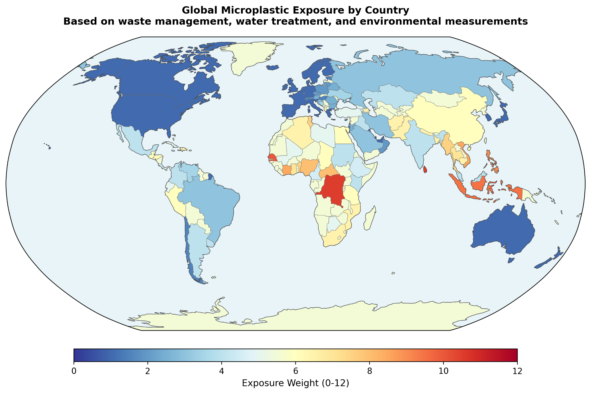
Once the covariate and observation layers are combined through the calibration and dose pipeline, the model produces a country level exposure weight for use in the calculator. At the high end of the ranking, the largest modeled weights include Vanuatu at 12.0, Tuvalu and Sri Lanka at 10.5, the Democratic Republic of the Congo and Nauru at 10.5, Senegal and Tonga at 10.0, and Indonesia at 9.5. These countries tend to combine severe waste leakage with larger infrastructure deficits, which is exactly the pattern the Contamination Index is designed to surface.
At the lower end, countries such as the United States, Belgium, Malta, Israel, and Slovenia fall near the minimum weight of 1.0. The paper also highlights several benchmark countries that sit between those poles: Bangladesh at 6.5, India at 4.0, China at 6.0, Vietnam at 8.5, Brazil at 3.0, Mexico at 4.0, Turkey at 5.0, the United Kingdom at 1.0, Japan at 1.0, and Switzerland at 1.5. These examples are helpful because they make the scale more interpretable. The model is not simply separating a few extreme outliers from the rest. It is producing a gradient that moves through countries users are more likely to recognize and compare.
The paper also reports estimated daily body burden alongside those weights. In this framework, daily body burden refers to total absorbed particles per day from all modeled routes: GI absorbed particles from direct ingestion and mucociliary cleared inhalation, plus permanently retained alveolar particles. The absolute values should still be read cautiously, especially given the uncertainty around nanoplastic extrapolation, but the relative spread is the more important result. The ranking implies very large differences in background burden across countries rather than a narrow global band.
How much each estimate leans on direct evidence
Not every country's weight rests on the same depth of direct observation. The paper makes that explicit through a three tier evidence strength classification. Countries with at least 10 direct observations are labeled moderate evidence, a group that includes roughly 15 countries such as the United States, France, the United Kingdom, and China. Countries with 1 to 9 direct observations are labeled emerging evidence, covering roughly 25 countries. Countries with no direct observations are labeled modeled, covering roughly 130 countries whose weights are derived entirely from the covariate framework.
| Classification | Criteria | Countries |
| Moderate | >= 10 direct observations | ~15 countries (US, FR, GB, CN, etc.) |
| Emerging | 1-9 direct observations | ~25 countries |
| Modeled | No direct observations; pure covariate estimate | ~130 countries |
That classification is one of the more useful features of the results. It prevents the ranking from looking more uniform in certainty than it really is. At the same time, the paper argues that “modeled” does not mean arbitrary. Even in countries without direct measurements, the weight is still anchored to peer reviewed waste data from Jambeck et al. [1] and water infrastructure data from WHO/UNICEF JMP [2]. The distinction is not between real and invented evidence. It is between countries with some direct environmental confirmation and countries whose estimates remain fully infrastructure driven.
Why the ranking is steadier than the absolute numbers
The results section also makes clear where the largest uncertainty sits. The PSD extrapolation factor is the largest source of uncertainty in the absolute dose estimates. However, because the same PSD parameters are applied uniformly across all countries, the paper finds that the relative ranking is largely insensitive to the value of alpha. A change in alpha shifts all countries’ estimated doses by roughly the same multiplicative factor, preserving the overall rank order that ultimately drives the calculator weights.
This is an important distinction. It means the model is more stable as a comparative ranking tool than as an absolute exposure meter. The exact number of estimated absorbed particles per day may move materially depending on the nanoplastic assumptions. The order of countries is much less likely to. For a calculator built around relative exposure weighting, that is a meaningful result.
The smallest particles may matter most
The final result shown visually is the model’s size dependent bioavailability profile and barrier crossing logic. While this section is presented mainly through figures, its role in the results is still important: it reinforces that the modeled burden is not being driven by raw particle count alone. It is being shaped by which size classes are considered most likely to cross biological barriers and contribute to absorbed dose. That visual emphasis supports one of the broader findings of the paper: the smallest particles may matter disproportionately, even when they are the least directly observed.
Taken together, the results support a fairly clear conclusion. The model achieves broad enough country coverage to be useful, the observational layer is large enough to calibrate a comparative framework, and the final rankings suggest substantial geographic variation in background microplastic exposure. At the same time, the paper does not pretend that all countries are estimated with the same degree of confidence. That balance, broad coverage paired with visible uncertainty, is one of the stronger parts of the work.
What this model clarifies
The discussion is where the model becomes easier to interpret. By this point, the paper has already shown the mechanics of the framework and the broad shape of the rankings. The remaining question is whether that framework is actually the right one for this kind of problem. The answer offered here is yes, but only because the model is designed around the limitations of the measurement record rather than in denial of them.
Why infrastructure outperforms raw observations here
The central argument is straightforward: direct cross country comparison of microplastic observations is not reliable enough, on its own, to support clean geographic ranking. Once PSD normalization is used to harmonize different study windows, the normalization factor can vary by orders of magnitude, from roughly 40x to 1,900x. At that point, the methodological artifact can become larger than the geographic signal the model is trying to estimate.
That is why the model does not treat the global literature as a flat observational scoreboard. Instead, it uses the Contamination Index to rank countries based on more standardized national indicators, chiefly waste mismanagement and water treatment coverage, while using direct observations only to calibrate the relationship between CI and concentration. That shift in emphasis matters. It means a country with no direct measurements can still receive a defensible estimate if it has national infrastructure data. It means a country with many observations but strong methodological distortions, such as the freshwater heavy US record, does not automatically dominate the rankings. And it means the final ordering is more likely to reflect real infrastructure differences than measurement technique alone.
This is not the same as saying observations do not matter. They do. But their role is narrower and more disciplined here. They help estimate how CI maps onto concentration. They do not get final authority over individual country rankings when the observational record itself is still too heterogeneous to compare cleanly. That is a more conservative posture, but also a more credible one for a field where sensitivity thresholds, size windows, and sampling designs still vary so widely.
What the contamination index is actually capturing
The discussion also clarifies what the Contamination Index is actually trying to capture. The geometric mean formula combines two dimensions of waste mismanagement that a percentage only model would miss: infrastructure quality and absolute waste intensity. In practical terms, the index asks both what fraction of plastic waste is mismanaged and how much mismanaged plastic waste enters the environment on a per person basis. By using the geometric mean, the model avoids letting either dimension dominate the other. A country that mismanages all of a very small waste stream should not automatically outrank one that mismanages a smaller fraction of a much larger stream.
The country examples make that logic easier to see. Indonesia combines very high waste mismanagement with above median per capita mismanaged plastic and weak water treatment, producing a CI of 1.05. Bangladesh has worse waste mismanagement by percentage, but much lower per capita waste generation, so its CI is lower at 0.41. India sits much lower still, not because its infrastructure is strong in every sense, but because the model assigns it a very low per capita mismanaged plastic intensity relative to the global median. China lands in between, combining moderate mismanagement with higher intensity and stronger water treatment coverage. These are not just ranking anecdotes. They show why the model needed something more nuanced than a single percentage variable.
The population denominator matters too. Per capita intensity is calculated using total population from What a Waste 2.0 [8], not coastal population as in the original Jambeck framing. That choice reduces distortion for island nations and coastal geographies, where coastal population can inflate apparent per person waste burden. The ratio is also capped at 10 times the global median to keep extreme outliers from warping the whole scale. Together, those choices make CI less dramatic than it might otherwise be, but also more stable and more interpretable.
CI also plays a second role beyond concentration ranking. It acts as an ambient exposure multiplier on total body burden, capturing ordinary contamination sources that are not directly represented by the air, freshwater, and ocean inputs alone. That includes things like food packaging, street dust, unmonitored water sources, and other background environmental pathways. Countries with CI values near zero, such as the United States, the United Kingdom, Japan, Germany, and Australia, receive no ambient multiplier, reflecting a model assumption that their baseline burden is already adequately represented by the directly modeled media.
How this fits the Winnow calculator
This section is also where the paper reconnects the model to the actual calculator. The country's weight does not stand alone. It feeds into an additive scoring system in which the total score equals a baseline of 35 plus country weight, urban or rural modifier, diet factors, home factors, lifestyle factors, and demographics. Geography therefore contributes meaningfully, but not exclusively, to the final score. It is one input among several, rather than a master override.
The paper’s Jakarta and Tokyo comparison helps show what that means in practice. A user in Jakarta receives Indonesia’s country weight of 9.5, and if they are urban, another +4, for a total geographic contribution of 13.5 points. A user in Tokyo receives Japan’s country weight of 1.0 plus the same urban modifier, for a total of 5.0 geographic points. That 8.5 point difference on a 1 to 100 scale corresponds to an estimated roughly 29x difference in modeled environmental microplastic body burden, about 51,000 absorbed particles per day versus about 1,785. The point is not that these figures should be read as precise personal measurements. It is that the geographic component is large enough to matter and structured enough to justify inclusion in the broader exposure score.
Taken together, the discussion makes the model’s logic clearer. The framework is not claiming to directly measure personal exposure country by country. It is claiming that infrastructure quality is a defensible basis for relative ranking when direct observations remain too inconsistent to do that work alone. That is a narrower claim than absolute measurement, but it is also a stronger one.
What this model can say, and what it still cannot
This model is useful, but it is not complete. Its strengths come from being structured and transparent. Its limits come from the same place. The framework depends on a small number of national indicators, a heterogeneous environmental measurement record, and a set of explicit assumptions about how particles move from environment to body. That is enough to support a defensible relative ranking. It is not enough to claim a final or comprehensive account of real world human exposure.
One important limitation is simply time. The waste data from Jambeck et al. [1] is now more than a decade old, while the WHO/UNICEF JMP water data [2] is newer but still only a snapshot. Waste infrastructure is not static. Some countries have likely improved meaningfully since 2015, while others may have worsened or shifted in more uneven ways. That raises a practical open question: how much would the rankings change if the model were rebuilt on a more current waste baseline? Updated national waste audits and newer infrastructure datasets would help answer that directly.
There is also a limit to what the Contamination Index can hold. CI captures infrastructure quality, per capita waste intensity, and water treatment gap in a single value, but it cannot fully represent industrial plastic production, atmospheric transport, regional hydrology, or the difference between coastal and inland exposure conditions. In other words, it compresses a complex environmental reality into one comparative signal. That compression is useful, but it also leaves open the question of what additional national or subnational variables would materially improve the model without making it unstable or opaque.
The freshwater pathway remains one of the weaker parts of the pipeline. Only two countries, the United States and China, have enough freshwater observations for even a minimal calibration attempt, which means freshwater concentrations ultimately fall back to an empirical formula anchored to CI rather than a well supported regression. That makes freshwater the weakest calibrated component of the model and leaves a straightforward open question behind it: what would the framework look like with a broader, better balanced freshwater measurement base across countries?
More broadly, the model still inherits some of the observational mess it is trying to manage. PSD normalization artifacts do not disappear just because the model is covariate driven. They are reduced, but not eliminated. Countries measured with different size windows still contribute systematically different values to the calibration set, which means the fitted relationship between CI and concentration absorbs some methodological noise along with the environmental signal. That is one reason the model should be read as structured estimation rather than clean empirical truth. It also points to a larger field level question: how much better would comparative microplastic modeling become if standardized international measurement protocols were widely adopted?
Granularity is another constraint. The model assigns a single country weight, then partially adjusts with an urban or rural modifier. That helps, but only a little. A person living in rural Montana and a person living in downtown Los Angeles should not be assumed to inhabit the same exposure environment simply because both live in the United States. The same is true for industrial corridors, agricultural regions, coastal communities, and heavily urbanized districts within many other countries. So one open question is not just whether the model can be updated, but whether it can eventually be resolved downward into more useful regional or city level layers without losing the clarity that makes it workable now.
The largest absolute uncertainty still sits in the nano range. The power law extrapolation from measured microplastics to estimated nanoplastics spans roughly 3 to 4 orders of magnitude in the 90% confidence interval. That means the model’s absolute body burden estimates should be read as order of magnitude indicators, not precise counts. The ranking itself is more stable, because the same PSD assumptions are applied across countries, but the open question remains central: what is the true abundance of nanoplastics in environmental media at scale? Direct measurement approaches, including newer imaging and analytical methods such as SRS microscopy [36], may eventually reduce that uncertainty, but the evidence base is not yet broad enough to carry that weight.
The biological validation question is equally important. The model predicts relative differences in body burden across countries, but those predictions still need real world testing. In principle, matched blood or stool studies across higher CI and lower CI populations should show corresponding differences if the framework is directionally right. Existing work by Schwabl et al. [34] and Leslie et al. [25] helps show that these kinds of biological measurements are possible, but those studies were not designed as cross country validation exercises. That leaves a clear next step for the field: not just building better exposure models, but testing whether those models track meaningful differences in human samples.
Finally, the model omits dermal uptake. That is a reasonable choice based on current evidence that intact skin blocks most particles larger than 100 nm [15], and on the broader judgment that dermal contribution is likely negligible relative to inhalation and ingestion [4]. Still, it remains an assumption rather than a universal law. If future work shows more meaningful uptake for nanoplastics in textiles, cosmetics, or occupational settings, then this framework would underestimate total burden through that route. The omission is justified for now. It should not be treated as permanently settled.
Taken together, these limitations do not make the model unhelpful. They define the boundary of what it can honestly claim. The model is strongest as a relative exposure framework built for comparison, not as a precise meter of personal burden. And the open questions it leaves behind are not peripheral. They point directly to what the field most needs next: newer infrastructure data, better freshwater and nanoplastic measurement, more standardized methods, and biological validation across real populations.
What becomes visible when geography is included
Stepping back from the mechanics of the model, the broader pattern is fairly clear: national waste management infrastructure appears to be a strong predictor of relative microplastic exposure, and the differences it points to are not trivial. In this framework, the spread between the highest and lowest ranked countries is large, on the order of roughly 220x in estimated daily absorbed body burden. Even between commonly compared countries such as the United States and Indonesia, the modeled difference remains substantial, at roughly 29x. These are not small variations that disappear into background noise. They suggest that chronic environmental exposure may differ by orders of magnitude across places, not just by marginal increments.
The most plausible interpretation is that waste infrastructure functions as a kind of master variable for ambient microplastic contamination. When plastic waste is not effectively collected, contained, or treated, more of it is able to enter surrounding soil, waterways, and air, where it fragments and moves into the human exposure chain through multiple routes. Water treatment then acts as a secondary filter, reducing at least some downstream burden where systems are stronger. The Contamination Index was built to capture that two part structure in a form simple enough to model and transparent enough to interrogate. It does not explain everything. But it appears to explain enough to be useful.
There is also a broader methodological point here. One of the main obstacles in global microplastic exposure assessment is not the total absence of data. It is the abundance of data that cannot be cleanly compared. Different size windows, different methods, different units, and uneven geographic sampling make direct country to country comparison far less stable than it first appears. By anchoring the model to standardized national indicators and using environmental observations mainly for calibration, the covariate driven approach offers a way to preserve signal without being ruled by methodological noise. That may be one of the more transferable insights in the paper. Similar frameworks could likely help in other environmental exposure problems where national level predictors exist but direct measurement remains heterogeneous.
The route specific dose model also surfaces something the field does not always make intuitive enough: inhaled particles are not entirely separate from ingested ones. A large share of deposited airborne microplastics is ultimately cleared to the GI tract through mucociliary transport, where those particles then join directly ingested particles and follow the same size dependent absorption logic. In that sense, inhalation is partly an ingestion pathway in disguise. Its more distinct contribution is alveolar retention, the smaller fraction of particles that remains in deep lung tissue rather than being cleared out. That distinction matters because it changes how exposure pathways are understood, and potentially how interventions are prioritized. Measures that reduce oral exposure address the dominant absorbed route, while measures that reduce airborne exposure may matter more specifically for lung retention.
At the same time, the model leaves several important questions open. The waste baseline still depends heavily on Jambeck et al. [1], and the global waste landscape has likely shifted meaningfully over the past decade. Nanoplastic abundance remains one of the largest sources of absolute uncertainty, with newer methods such as SRS microscopy [36] beginning to improve direct measurement but not yet at a scale sufficient to settle the question. And perhaps most importantly, the model’s predicted country level differences still need biological validation in real populations. Studies such as Schwabl et al. [34] and Leslie et al. [25] show that human stool and blood measurements are possible. What the field still needs is a more deliberate effort to test whether higher and lower modeled burden actually tracks with standardized human measurements across countries.
So the most appropriate conclusion is neither certainty nor dismissal. It is that relative geographic exposure appears structured enough to model, important enough to matter, and uncertain enough to demand better tools. This framework should not be read as a precise meter of personal burden. It should be read as a transparent attempt to make a diffuse global exposure problem more comparable, more discussable, and more testable. In that sense, its value is not only in the rankings it produces. It is also in the clearer set of questions it leaves behind.
References
- 1.↑ Jambeck, J. R. et al. Plastic waste inputs from land into the ocean. Science 347, 768–771 (2015). PubMed
- 2.↑ WHO/UNICEF (2022). Joint Monitoring Programme for Water Supply, Sanitation and Hygiene (JMP). World Bank indicator SH.H2O.SMDW.ZS. WHO
- 3.↑ ICRP (1994). Human Respiratory Tract Model for Radiological Protection. ICRP Publication 66. Annals of the ICRP, 24(1-3). PubMed
- 4.↑ Nor, N. H. M., Kooi, M., Diepens, N. J. & Koelmans, A. A. Lifetime Accumulation of Microplastic in Children and Adults. Environ. Sci. Technol. 55, 5084–5096 (2021). AtlasPubMed
- 5.↑ Eriksen, M. et al. A growing plastic smog, now estimated to be over 170 trillion plastic particles afloat in the world’s oceans—Urgent solutions required. PLOS ONE 18, e0281596 (2023). PubMed
- 6.↑ Evangelou, I., Bucci, S. & Stohl, A. Atmospheric microplastic emissions from land and ocean. Nature 649, 1186–1189 (2026). AtlasPubMed
- 7.↑ WHO (2019). Microplastics in drinking-water. Geneva: World Health Organization. WHO
- 8.↑ Kaza, S., et al. (2018). What a Waste 2.0: A Global Snapshot of Solid Waste Management to 2050. World Bank. Openknowledge
- 9.↑ Isobe, A. et al. A multilevel dataset of microplastic abundance in the world’s upper ocean and the Laurentian Great Lakes. Microplastics Nanoplastics 1, 16 (2021).
- 10.↑ Kosuth, M., Mason, S. A. & Wattenberg, E. V. Anthropogenic contamination of tap water, beer, and sea salt. PLoS ONE 13, e0194970 (2018). PubMed
- 11.↑ Tong, H., Jiang, Q., Hu, X. & Zhong, X. Occurrence and identification of microplastics in tap water from China. Chemosphere 252, 126493 (2020). AtlasPubMed
- 12.↑ Mintenig, S. M., Löder, M. G. J., Primpke, S. & Gerdts, G. Low numbers of microplastics detected in drinking water from ground water sources. Sci. Total Environ. 648, 631–635 (2019). AtlasPubMed
- 13.↑ Turcotte, D. L. Fractals and fragmentation. J. Geophys. Res.: Solid Earth 91, 1921–1926 (1986).
- 14.↑ Kooi, M. & Koelmans, A. A. Simplifying Microplastic via Continuous Probability Distributions for Size, Shape, and Density. Environ. Sci. Technol. Lett. 6, 551–557 (2019).
- 15.↑ Schneider, M., Stracke, F., Hansen, S. & Schaefer, U. F. Nanoparticles and their interactions with the dermal barrier. Derm.-Endocrinol. 1, 197–206 (2009). PubMed
- 16.↑ Jenner, L. C. et al. Detection of microplastics in human lung tissue using μFTIR spectroscopy. Sci. Total Environ. 831, 154907 (2022). AtlasPubMed
- 17.↑ Walczak, A. P. et al. Behaviour of silver nanoparticles and silver ions in an in vitro human gastrointestinal digestion model. Nanotoxicology 7, 1198–1210 (2013). PubMed
- 18.↑ Walczak, A. P. et al. Translocation of differently sized and charged polystyrene nanoparticles in in vitro intestinal cell models of increasing complexity. Nanotoxicology 9, 453–461 (2015). PubMed
- 19.↑ EFSA Panel on Contaminants in the Food Chain (CONTAM). Presence of microplastics and nanoplastics in food, with particular focus on seafood. EFSA J. 14, e04501 (2016). AtlasPubMed
- 20.↑ U.S. Geological Survey (2025). Microplastics in US Rivers and Streams. USGS Water Resources Data. Available at: Usgs
- 21.↑ NOAA National Centers for Environmental Information (2023). Marine Microplastics Database. Available at: Ncei
- 22.↑ Nihart, A. J. et al. Bioaccumulation of microplastics in decedent human brains. Nat. Med. 31, 1114–1119 (2025). AtlasPubMed
- 23.↑ Geyer, R., Jambeck, J. R. & Law, K. L. Production, use, and fate of all plastics ever made. Sci. Adv. 3, e1700782 (2017). PubMed
- 24.↑ Cox, K. D. et al. Human Consumption of Microplastics. Environ. Sci. Technol. 53, 7068–7074 (2019). AtlasPubMed
- 25.↑ Leslie, H. A. et al. Discovery and quantification of plastic particle pollution in human blood. Environ. Int. 163, 107199 (2022). PubMed
- 26.↑ Thompson, R. C. et al. Lost at Sea: Where Is All the Plastic? Science 304, 838–838 (2004). PubMed
- 27.↑ Volkheimer, G. Persorption of Particles: Physiology and Pharmacology. Adv. Pharmacol. 14, 163–187 (1977). PubMed
- 28.↑ U.S. EPA (2011). Exposure Factors Handbook. EPA/600/R-09/052F. Washington, DC: National Center for Environmental Assessment. EPA
- 29.↑ Prata, J. C. Airborne microplastics: Consequences to human health? Environ. Pollut. 234, 115–126 (2018). AtlasPubMed
- 30.↑ Wright, S. L. & Kelly, F. J. Plastic and Human Health: A Micro Issue? Environ. Sci. Technol. 51, 6634–6647 (2017). AtlasPubMed
- 31.↑ Marfella, R. et al. Microplastics and Nanoplastics in Atheromas and Cardiovascular Events. N. Engl. J. Med. 390, 900–910 (2024). AtlasPubMed
- 32.↑ Ragusa, A. et al. Plasticenta: First evidence of microplastics in human placenta. Environ. Int. 146, 106274 (2021). AtlasPubMed
- 33.↑ Brahney, J., Hallerud, M., Heim, E., Hahnenberger, M. & Sukumaran, S. Plastic rain in protected areas of the United States. Science 368, 1257–1260 (2020). PubMed
- 34.↑ Schwabl, P. et al. Detection of Various Microplastics in Human Stool: A Prospective Case Series. Ann. Intern. Med. 171, 453–457 (2019). AtlasPubMed
- 35.↑ Fournier, S. B. et al. Nanopolystyrene translocation and fetal deposition after acute lung exposure during late-stage pregnancy. Part. Fibre Toxicol. 17, 55 (2020). PubMed
- 36.↑ Qian, N. et al. Rapid single-particle chemical imaging of nanoplastics by SRS microscopy. Proc. Natl. Acad. Sci. 121, e2300582121 (2024). AtlasPubMed
- 37. Collin-Faure, V. et al. The internal dose makes the poison: higher internalization of polystyrene particles induce increased perturbation of macrophages. Front. Immunol. 14, 1092743 (2023). AtlasPubMed
Sign in to start a discussion.