Introducing the microplastic exposure calculator
A first version for making everyday microplastic exposure more relatable
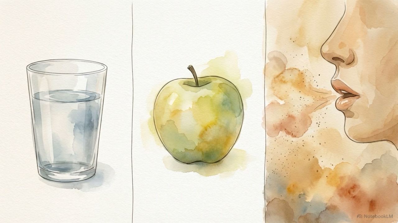
Microplastics are now part of ordinary life. They show up in water, food, air, dust, packaging, textiles, and the built environment around us. But while the word everywhere is accurate, it can also flatten an important truth: exposure is not identical from person to person.
Some habits likely matter more than others. Some environments appear to carry more burden. Some choices may reduce exposure at the margins, even if they do not eliminate it.
That is the gap we wanted to address.
Today, we are releasing version 1 of the Exposure Calculator, a simple tool designed to help people think more clearly about the patterns that may shape their everyday microplastic exposure.
Not as a diagnosis. Not as a lab result. And not as a claim of precision the science cannot yet support.
Just a more structured starting point.
Why we built it
One of the hardest things about microplastics is that the problem is both visible and invisible at the same time.
Visible, because plastic is everywhere around us.
Invisible, because personal exposure is hard to estimate in a way that feels concrete, practical, and honest.
Most people already understand the broad outline. Bottled water may matter. Heating food in plastic may matter. Indoor dust may matter. Synthetic materials may matter. Occupation, geography, and household environment may matter too.
But it is much harder to hold all of that in your head at once and come away with a reasonable picture of your own pattern.
That is what this calculator is for.
It is an attempt to turn a scattered body of published exposure clues into something a person can actually use. Not a final answer. A first pass.
What version 1 does
The current calculator uses a weighted sum model.
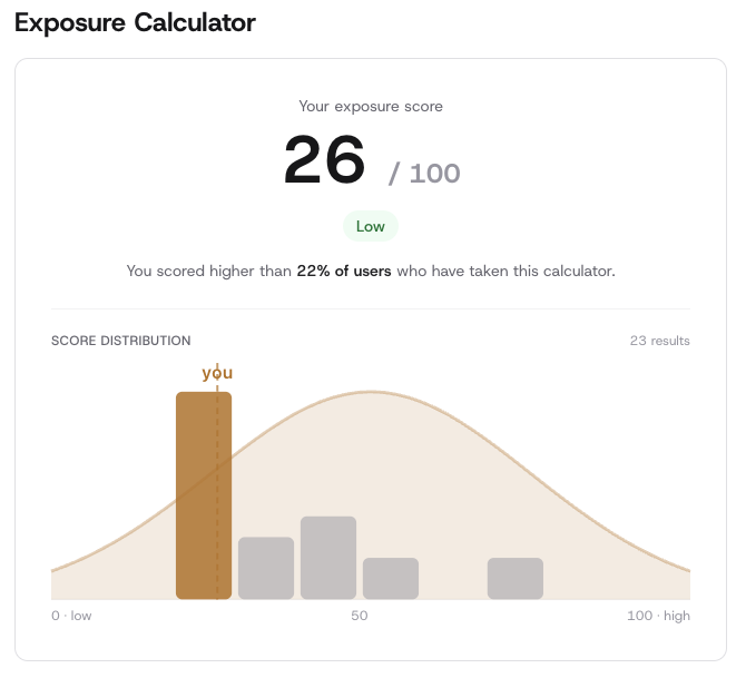
It begins with a baseline score of 35, meant to reflect a mid to low estimated exposure in the modern world, where microplastics are already broadly present in food, water, and air. From there, the score moves up or down based on the answers a user gives across 19 questions. Those questions map to 29 weighted factors across five categories: demographics, diet, geography, home, and lifestyle. Scores are then clamped to a 1 to 100 range.
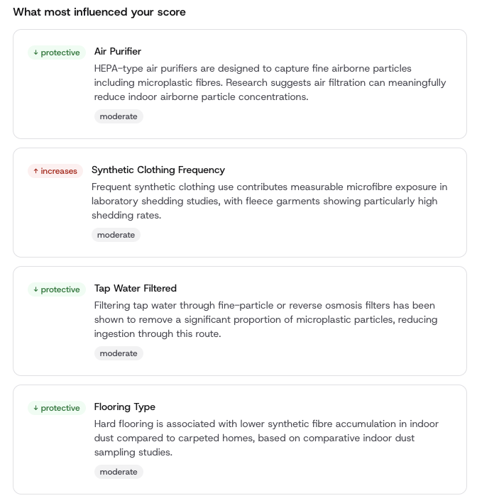
Some factors increase the score. Others lower it.
For example, the model currently gives stronger positive weight to patterns like frequent bottled water use, seafood intake, industrial occupational exposure, microwaving food in plastic, and synthetic carpet in the home. It also includes potentially protective factors such as water filtration, hard flooring, and air purification. Some areas are supported by stronger evidence than others, so each factor is also tagged by evidence level: strong, moderate, or emerging. Explore the exact methodology for more details.
That part matters.
We did not want to present the output as though every exposure route is equally settled. It is not. Some are well supported. Some are directionally plausible but less certain in magnitude. Some are still early.
So the calculator tries to do two things at once: offer a usable estimate while staying transparent about where the science is firmer and where it is still developing.
What the score means
The score is best understood as an indicative exposure profile.
It is a relative model, not a direct biological measurement.
A higher score does not mean we know exactly how many particles are entering your body. A lower score does not mean exposure is absent. It means that, based on the published literature used in this version, your pattern appears more or less associated with known or plausible exposure routes.
That distinction is important.
In a field like this, false precision can sound scientific while actually being less honest. We would rather be clear about what the tool can do than overstate what it cannot.
This is not a medical assessment. It is not a clinical test. It is not a substitute for direct measurement. It is a literature-informed estimate meant to help people see the shape of exposure more clearly.
Why release a version 1 at all
Because waiting for perfect measurement can become a way of saying nothing useful in the meantime.
Microplastics research is still maturing. Human measurement remains difficult. Real world exposure is variable. And many important questions remain open.
But that does not mean we should avoid building practical tools.
It means we should build them carefully, label them honestly, and improve them in public.
Version 1 is our first attempt to do that.
We would rather release something transparent, limited, and useful now than pretend the only acceptable tool is one that arrives after every uncertainty has been resolved.
Science usually does not move that way. Good tools often begin as provisional ones.
What will change over time
This calculator should be understood as a living model.
As the literature improves, the weights should improve. As evidence strengthens, some factors may move up or down. As new routes become clearer, new questions may be added. As weak assumptions are exposed, they should be revised or removed. That is not a flaw in the project. That is the project.
The goal is not to freeze a complicated field into a permanent score. The goal is to build a practical framework that can evolve with the evidence.
We expect future versions to get sharper, more nuanced, and more useful.
Why this fits Winnow
At Winnow, we care about exposure not just as a headline, but as a practical reality.
That means taking the science seriously without overstating it. It means making complexity more navigable. It means building tools that help people think better, not panic faster.
The Exposure Calculator is part of that effort.
It sits in the same spirit as the rest of our work: careful, evidence-aware, open about uncertainty, and oriented toward everyday life.
Because if exposure is chronic, low level, and distributed across habits and environments, then people deserve tools that reflect that reality with some discipline.
Not perfectly.
But usefully.
Try it
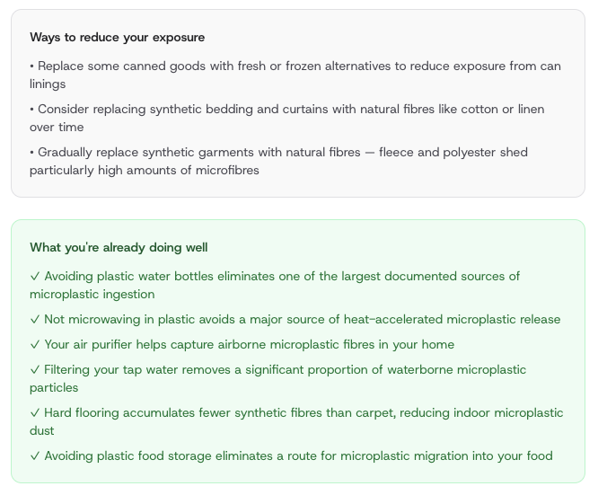
You can explore the calculator now and see how your own pattern scores. Learn which everyday behaviors may be contributing to higher exposure.
And which changes may help reduce it over time.
Log in to save your results and check back as your habits change. You can also share the calculator with friends or family who want a clearer picture of their own exposure patterns.
And because this is version 1, feedback matters. If a question feels unclear, if a factor feels missing, if it's too broad and needs granularity, or if there is a piece of literature you think should shape future versions, we want to hear from you. Just comment below. This is an early tool. We intend to keep improving it.
Sign in to start a discussion.